
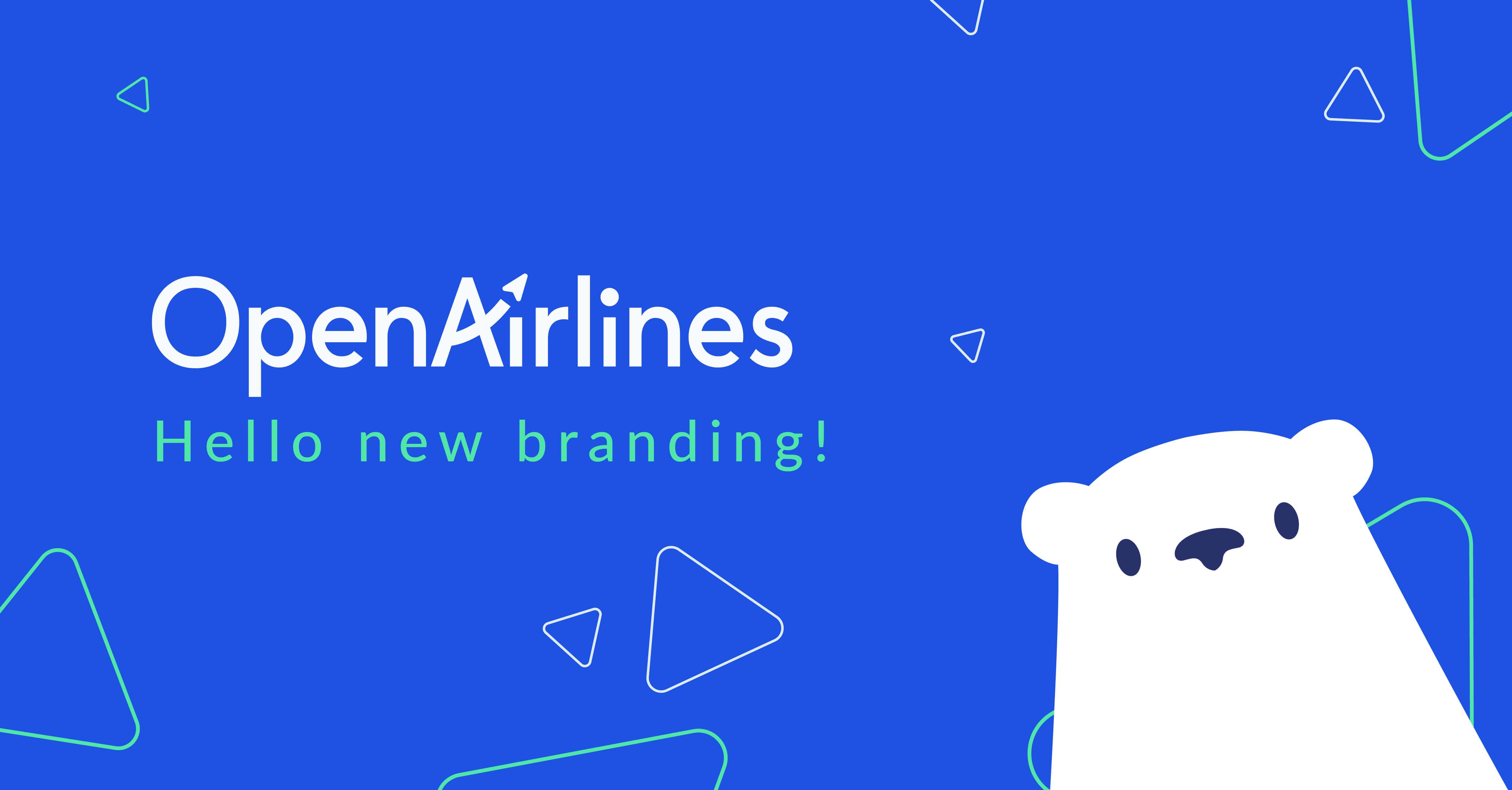
We’re proud to launch the new OpenAirlines’ visual identity today!
It’s been months in the making, so we’re excited to finally show it to the world (and who are we kidding, to start using it!). Let us introduce you to the new look. And who better to give you the grand tour than Eloïse Malié, Lead Graphic Designer at OpenAirlines who made the magic happen?
The story behind this evolution
OpenAirlines is evolving, and so is our brand!
In the past year, we’ve grown our team and revenue by 50%! It means we have plenty of new faces in the office and many new enthusiastic customers who joined the OpenAirlines’ adventure. 🤩 It’s exciting to have such rapid growth yet it brings challenges too, such as preserving our company’s culture.
Our product is also evolving! Last year, our flagship product SkyBreathe® became the SkyBreathe® 360° eco-flying platform, a multi-tool solution designed to meet the needs of our fast-moving industry, engage all stakeholders, and spread a vibrant green culture in our airline partners.
Not to mention that trends are moving fast in the design world, and some go out of fashion pretty quick and can suddenly feel outdated. Not a good look for a brand! Companies usually change their logo every 4 to 5 years to stay relevant and modern.
So, why a new branding?
By reworking our visual identity, we wanted to adapt to these changes, yet also reaffirm our identity as a cleantech company comprising a team of highly qualified fuel experts and engineers. We wanted to highlight our core values, such as excellence, innovation, transparency, and impact to only name a few, as well as our customer care & green culture. These aspects lay the foundation of our company and people should get a feel of who we are and what we stand for just by looking at our brand.

“I joined OpenAirlines about eight months ago, and from the beginning, I saw some discrepancy between who we are and what our brand identity said about us,” says Eloïse.
“I felt some pieces of the puzzle were left out. Some key aspects of our identity, “personality” almost, were lost in translation. For example, we’ve been around for almost 15 years, so we’re not what one would call a startup anymore! Yet as soon as I joined, I was overwhelmed by the vibrant, agile, can-do mindset typical of new tech companies. I would not have guessed it was such a big part of our culture from the outside, that’s for sure!”
The idea was not to start everything from the ground up but to build from the existing brand, adapt it to our evolution and give it a fresh look.
Hello, new logo!
Introducing the 2022 OpenAirlines logo! Redesigning our logo was, of course, the most important piece of the puzzle in this project. It is not radically different from its predecessor, yet subtle touches give it a whole new feel and a much more modern twist.
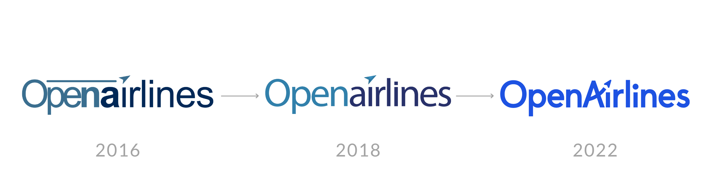
“We kept the arrow graphic detail acting as a dot for the “i”. It is a wonderful metaphor for aviation, take-off, forward-thinking, innovation... I like that it stands right in the middle of our logo to show that all these topics are at the heart of OpenAirlines”.
“If you watch closely, you will notice that the letters are not quite aligned, and the “i’’s are shorter than the other letters. The aim was to loosen up our logo and show our flexibility and playfulness. Again two strong aspects of our company’s culture.”
 “Finally, I created a responsive logo that is very handy to use on smaller formats, for social media profiles, for example. It gives us one more tool in our branding box for more adaptability.”
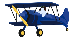
Viktor has got a makeover!
 Have you met Viktor, our mascot? Our beloved polar bear has been watching over OpenAirlines for many years now, and we wanted him to be an even bigger feature!
Viktor is caring, fun, passionate, and a little bold (it takes an adventurous mind to become a fuel-expert polar bear!), not unlike our team. It made sense to give him a special place in our new branding.

“The keyword here was sim-pli-ci-ty! At OpenAirlines, we’re big on the “Keep it simple” motto. We try to avoid complexity as much as possible in everything we do, whether in terms of processes or in the product itself. A quality well appreciated by our clients!"
 "That’s why we created a more minimalist, playful, and versatile version of Viktor that is easier to draw and gives us more flexibility in its usage. For example, he will make many more appearances on our social media channels and emails soon. He is becoming a more of “social” entity, almost like a spokesperson on its own!"
"He is also very much present in the office with us. It helps to create a joyful and laidback space for some serious work!”
A splash of colors
We wanted to differentiate OpenAirlines, the company from SkyBreathe® its product. Yet using the same color for both could lead to some confusion. Our recent work on colors means we have now two distinct visual identities: our SkyBreathe® green remains the primary color of our product, and is no longer part of OpenAirline’s brand identity.
As we say goodbye to the SkyBreathe® green, we make room for some vibrant new colors 🎨
“I had a lot of fun creating this palette. Again I did not want to sweep away our historic color completely, but I wanted to shake things up a little and introduce some more peppy, vibrant shades to play with,” says Eloise.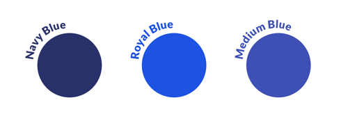
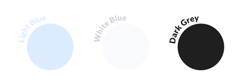
“Blue is a classic for tech companies as it represents innovation, trustworthiness, dependability, and intelligence. OpenAirlines is no exception and our historic navy blue serves that purpose. Yet that color alone felt a little “too corporate” for us, and it didn’t match our rebellious spirit! That’s why we introduced a new color: Royal Blue. It is a bolder, more electrifying shade that contrasts with the navy blue and brings out the more adventurous side of OpenAirlines.”
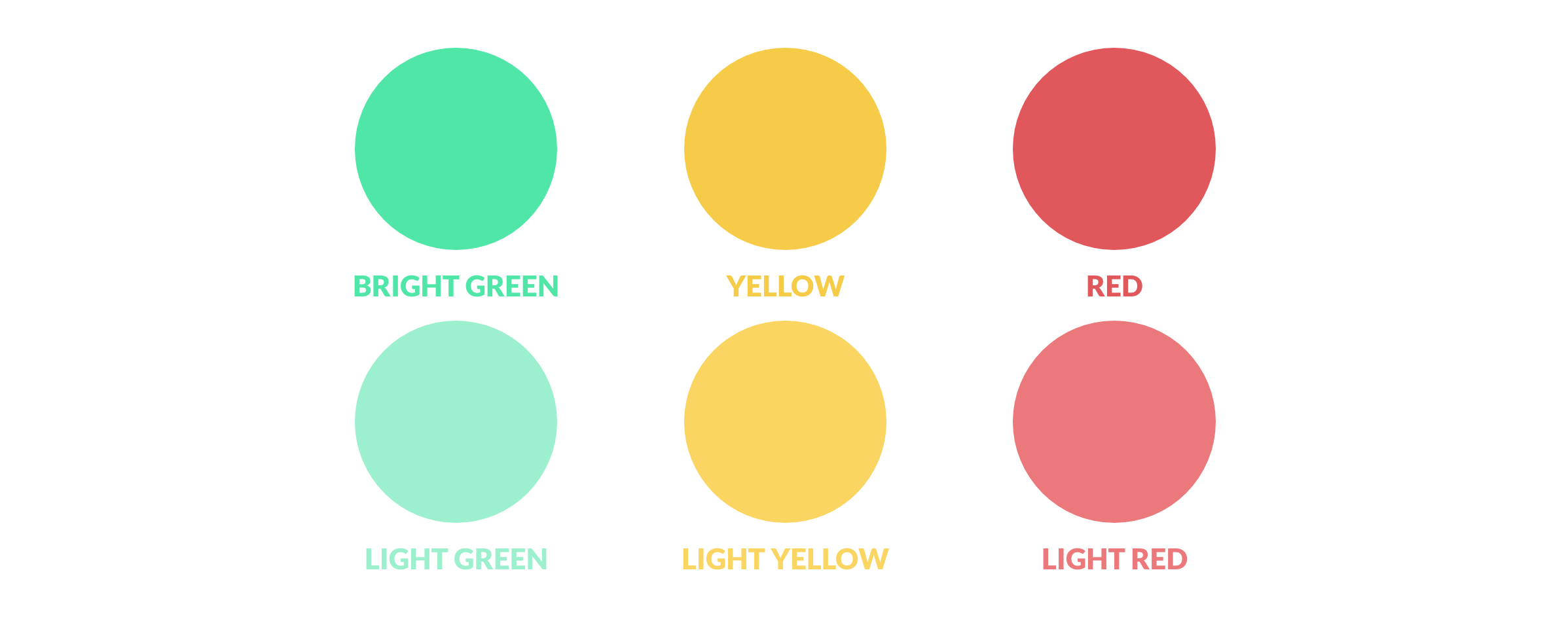
“The palette also includes a range of secondary colors: reds, yellows, and greens, a little more saturated than what we had before to create a more striking and dynamic image.”
This new visual identity marks the beginning of a new page for OpenAirlines. Let it be positive, daring, impactful, stimulating…royal!
LEARN MORE
Curious about OpenAirlines' mission to accelerate the world's transition to sustainable aviation?
Check out our mission statement >> Why we want to help airlines kick-start the green shift